Friday 12 May 2017

Hand-Drawn design


 These are the images of my hand-drawn design. I think my hand-drawn follows the codes and conventions. Firstly, for each person I decided to have a title, sub heading which makes it easier for my target audience to see what pages there will be on. This is conventional by having a my magazine similar to real magazine productions. Through my research, majority of the exclusive music magazine has a title on each of there pages.
 On each magazine page I have a images that will be my music model. This will be suitable to my music magazine and to its music genre (Hip-Hop) By having a image of my model on each page will draw my target audience how ever it will also portray the main focus of my magazine. This will draw male and female, both genders will be interested about reading my magazine which will be a advantage to distribute my magazine.
 Furthermore, my magazine cover page, contents page and double page includes information which makes my magazine conventional. This is because it meets the need of the target audience I chose. The 15-20 years old will buy a magazine that will meet their needs. When my target audience buys my magazine,there will be enough information to meet their standards. 

Thursday 11 May 2017

Final products


I think that all three of my magazines pages was successfully created. This is because it suit the music genre I chose (Hip-Hop).I also think its conventional,this suggests that my magazine will meet its target audience successfully.

My magazine cover is presented as a conventional media product. This implies the correct codes and conventions that my magazine cover has, initially this resembles to make my music magazine like a real media product. My media front cover for example has a maths head which all the magazines have, additionally my magazine cover contains main headlines which portrays my magazine as a real production.

My contents page is also conventional and sell successfully to the target audience , the main reasons are my contents page has a variety of pages to preview and read from. The makes it an advantage for the reader, to have a variety of information to read that is about music. I also think generally I have met, portrayed the Hip-Hop genre throughout all three pages. The colour red in this page has successfully suit Hip-Hop music.

My double page is lastly conventional as well.  The image I used for my double page is used the second half of the magazine page. I chose this because I thought a lot of text on a double page will bore the target audience I chose (15-20). So I decided to use the second half of the page , just for the models image. This was completed successfully which makes my double page conventional as well.

Tuesday 9 May 2017

Contents page draft

                    The codes and conventions 

The image used for my contents page I think its an suitable choice which suits my contents page. I think this because the image leaves space for the left side to include the different features. The image is clear for the audience to see properly. This images follows the codes and conventions by having an image on my contents page that represents my model (artist).

The title for my contents page 'Kidrauhl', used the colour brown which represents a warmth and honestly connotations. This implies the connotations of my magazine as well. The other title 'contents', I used the colour red which represents loudness,  This suits the music genre I chose ( Hip-Hop).  This is conventional by having colours that represent the genre I chose. The colour red represent loud music which Hip -Hop music is actually loud, noisy music. Likewise, the two title states their purpose on the contents page. The title 'Kidrauhl' is the title for the whole magazine which I used again for my contents page, I done this because I wanted the reader to exactly know the purpose of repeating my title and portray a music title through all three pages. This is conventional, by using the codes and conventions to portray a accurate title that looks like a real magazine.

In addition, the letter 'S' is a feature that may draw the audiences attention. The letter 'S' represents my models name (Sema) This is conventional,it suggests the accurate codes and conventions there is to be able to meet requirements of my target audience.

Improvements


The improvement that I need to make is to add features such as the pages. This will make my magazine look realistic, like a real magazine. This will also make my magazine page look conventional by adding music features for example " Page 5, Top 50 music list". This will make my media music magazine look like a real music magazine. Likewise, it will make it more like a Hip-Hop magazine.

Also I would want to add a website to make my magazine look like a well known magazine. Also it will suggest to my target audience how professional my magazine is. This will be an advantage for the audience who will be reading my magazine to have additional information about Hip-Hop magazine and information about my magazine in general. This will also be conventional because I will be addressing my Hip-Hop genre the most.

Double page draft

 The codes and conventions

The heading used for my double page is the colour brown. The colour brown implies an unconventional convention. The colour brown I think doesn't suit the Hip-Hop genre which I need to improve and develop and research the main colours that is used for a Hip-Hop music magazine.

The subheading I used, used the colour black which I think is a suitable colour to use with a white background . This is conventional because the sub heading that I used is clear , easy to read for the audience. In addition, this is an advantage for the audience to have a summary before reading the text below. This is also a feature that is conventional because a lot of real media magazine have that, which is easier to know what the audience is ready to read below.


The text below is a interview which I had a choice of a interview or a article I chose a interview. I decided to choose a interview because for a music magazine a interview will be more realistic and engaging. My interview contains a conversation between the interviewer and the music artist which is my model.  The purpose of choosing a interview is, it conveys more information about the music artist which is an advantage for the audience to read and have more information about the music artist. This makes the double page conventional because it includes conventions that targets my audience.

The drop cap 'W', this is used for a lot of music magazines. This suggests of where the reader should start from reading from. The 'W' is the same colour to the body text, this suggests that they are both the same. It is conventional to have a drop cap to help the reader to know where to start reading from.

 Improvements

There are improvement that I need to consider such as changing the colour of heading. For example I may consider of using the colour red or purple that then will suit a Hip-Hop genre. Also I will need to add a image that represents my model. This can be over the second half of the page. By having a image of my model, it will then make it conventional and an image representing my model.
Moreover, I will want to add colour to my double page background. The colour I may use is either blue or red. By having a continuous colour, colour scheme it will draw the attention from the audience.

Magazine cover draft

                                   The codes and conventions 


For the maths head I used the colour red, this is because I wanted to have a colour scheme, House style of the colour red that will be used on every page. I have chose this because I thought the colour red will be suitable for a Hip-Hop music genre. This is conventional because it gives a hint to the reader of what music genre I have chosen. 
For the main headlines, I have three cover lines which suggest the information that will be included in my music magazine. The colours that I've used for my cover line is white and red. I have used the colour red for most of my draft because personally I think red suits Hip-Hop more than any colour. Through my research this was supported so I used red. On this page, the colour red has dominated the page which I think it is conventional. This is because the colour red looks pretty with my model and looks better for my magazine cover.

Also, the bar code also makes my magazine page conventional by suggesting that my magazine is a real product. Also this makes the editor (me) see how my magazine may be with a bar code. By my bar code being at the front of my magazine cover it is easier for the audience that will be buying my magazine to see where it is. I have challenged this convention by having my bar code at the front. Through my research I have found out that many of the music magazines have there bar codes at the back, its last page.

Improvements

There are improvements that I need to consider for my magazine cover , there are the lack of cover lines I have. This means, the target audience I chose (15-20) are ages that will be enthusiastic about music information. For my final product I will need to include additional,engaging information to draw my target audiences attention.

Also, for the skyline I may also use a different font which will then make it conventional and suit a Hip-Hop genre. For example using a different font may hint the Hip-Hop genre to the audience by just reading the skyline.

Pree production paper work

MES and Prop 
CINEMATOGRAPHY:
       The cinematography I plan to use in my music magazine consists of the following:
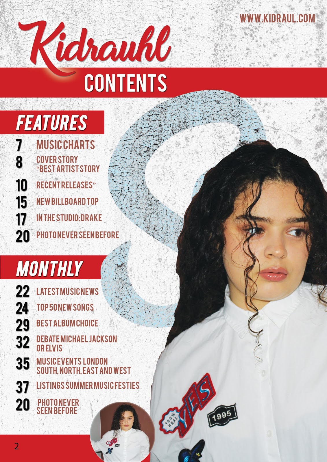
       1. Close up may be used for my contents page. I think this because the contents page will be taken serious from the other pages. This means a clear close up will be used to see an explicit image of the music artist.
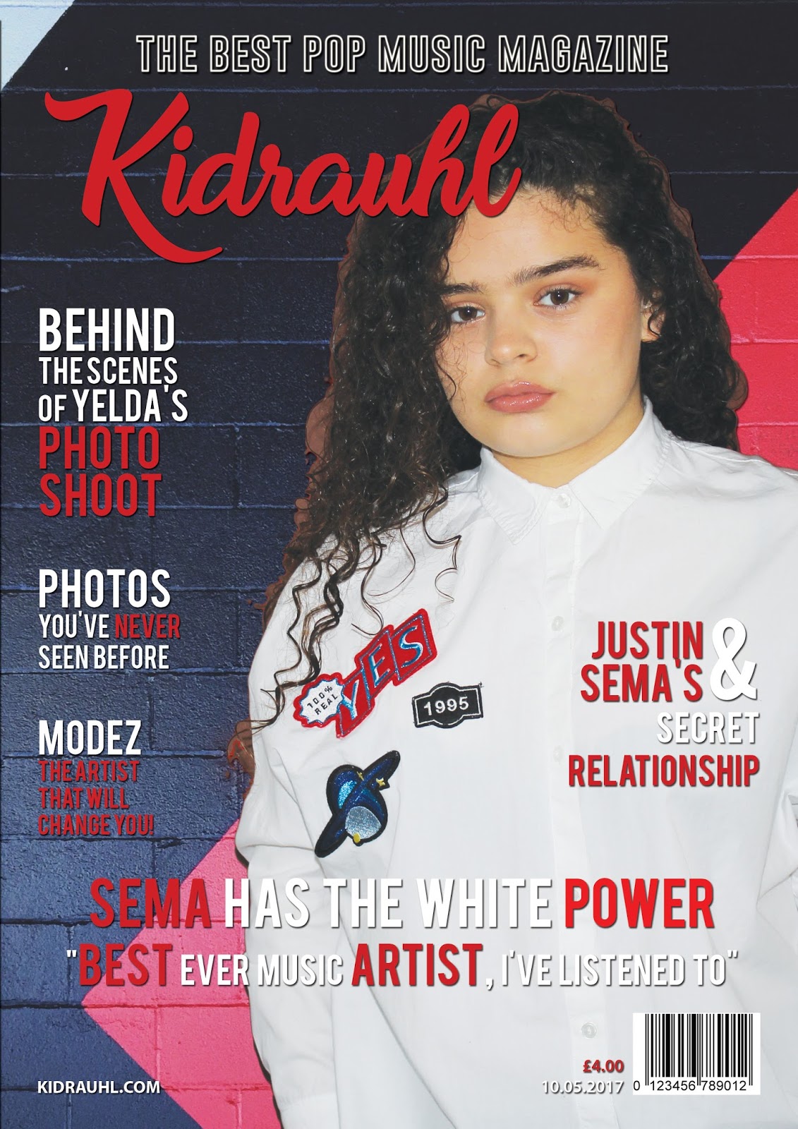
       2. Long shot will be used for my magazine cover. I think this because for the magazine cover it will be suitable to use an image, which has a full image of the music artist. In addition, this is conventional to the Hip-Hop music genre because it conveys a Hip-Hop style; my model would have a straight face, which will suggest seriousness of my model that links to the Hip-Hop genre.
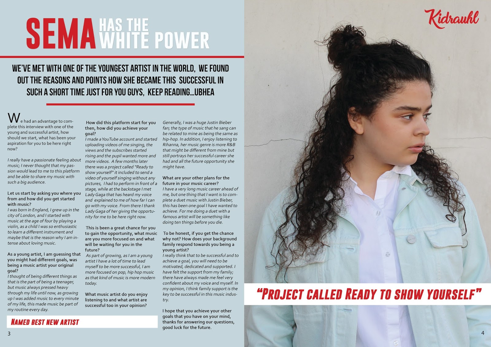
       3. Medium shot will be used for my double page spread. This suggests that the audience that will be reading my interview will be having a clear image of the artist next to it. This will be conventional, for the audience to have an image of the artist next to the text.

COSTUME, HAIR AND MAKE UP:
       The costume, hair and make-up I plan to use in my music magazine consist of the following:
       1. For my other image, the costume will be ripped black t-shirts and ripped black jeans. The t-shirt will be short sleeve and the ripped black jeans will be long, to the models ankle. This suggests a typical Hip-Hop look and style, which will make it obvious for the audience that my music genre is Hip-Hop.
       2. For my first image, the costume will be a denim jacket and a soft make-up. The denim jacket will be a light blue colour and a friend will do the make-up. I have chosen this; it suggests a music-based theme. In addition, this is conventional to the Hip-Hop music genre because it suggests a Hip-Hop sub-genre concept.
       3. For my other image, the costume will be white plain top and plain black jeans. These costumes will suggest a different expression of Hip-Hop music artist.

BODY LANGUAGE AND FACIAL EXPRESSIONS:
       The body language and facial expressions I plan to use in my music magazine consist of the following:
       1. For my first image, the body language will be the model standing half straight while their facial expression will be straight. I have chosen this because I would want my model to be taken serious, which I think Hip-Hop music genre is a most loved music genre. This is conventional to the Hip-Hop music genre because I think it is acceptable within the music genre I have chosen.
       2.  For the second image, the body language will standing straight while the facial expression might be her looking away. I have chosen this because it will give my model a different original view from the audience. This is conventional within my chosen music genre, by giving it a professional opinion.
       3. For my other image, the body image will be straight up, looking directly to the camera, as my models facial expression again being serious. I have chosen this because it will support my model to continue to draw the audience of how the music magazine suggests the Hip-Hop genre.

SETTING:
       The settings I plan to use in my music magazine consist of the following:
       1. The first setting will be in a busy place. I have chosen this setting because I would like to convey my model being within public and highlight my artist being around them. This will be conventional to Hip-Hop genre by the audience reading the artist music journey, the setting will be an advantage for the reader to the connection between the artist and the audience.
       2. The second setting will be in a quiet place, an example is an ordinary street. I have chosen this because I would like the audience to see the place my artist grew up in and how she developed and how she became famous. This links to my Hip-Hop music genre, how the images are taken from a street represent loud, Hip-Hop music.

I did not think it was needed to use Iconography because the use of costume and make-up was perfectly suitable which I think iconography will not be suitable for my music magazine.
LIGHTING:
       The lighting I plan to use in my music magazine consists of the following:
       1. Image one’s lighting will be high key lighting to reveal the artists natural face. I have chosen this use of high key lighting to attract male audience, which females were my target audience. This is conventional, high key lighting use within the images conveys that they are absolute attention of the reader.
       2. Image two’s lighting will be low key lighting to suggest the artist purpose of Hip-Hop genre. This suggests that my artist will be presented with dark lighting to add suspicion to Hip-Hop music genre.

I also do not think it was necessary to use any props, this is because I think I already conveyed the connotation within costume, setting, lighting and body language.

Monday 8 May 2017

Magazine Parent Companies

A Parent Company is a company that owns different brands. It is importance to have a Parent Company because it suggests the experience the company has of distributing magazines. This is an advantage of researching the right Parent Company to choose for my media product.


Image result for ipc brands

 IPC Media is a company that owns different brands such as 'LOOK,CHAT AND ESSENTIALS'. IPC Media also distributes magazines once a week to there audience. Specifically IPC Media has a target audience of who to aim there magazine too. IPC Media wants to gain a wider audience by creating magazine which are aimed for women. This means that IPC Media wants to spread and target new audiences to distribute there magazines.

Image result for hearst company
 Hearst is another example of a Parent Company, Hearst is known to be a popular publisher which is distributes magazines such as 'Country Living, Woman's Day and Red Book'.

Image result for international data group company  Produces large scale events, they produce over 97 countries. International data group is known to be informative magazines.  International data group is known to distributes magazines such as ' PC World, Computer World and Mac World"


Image result for town square company


Town square is an additional example of a Parent Company. Town square publishes magazines such as, ' XXL'. The 'XXL' magazine portrays the Hip-Hop music genre. The 'XXL' is published on a quarterly basis.

By having a Parent Company it is an advantage because it will guide my magazine produce through the production and the distribution. Additionally, the Parent Company will have experience and further knowledge which is an advantage of the company knowing how the magazine production will work and there will know the strengths and limitations of the whole production.

The Parent Company I would like to produce and distribute my magazine is ' Town-square'. This is because the genre of my music magazine is Hip-Hop. Town square is an suitable choice to distribute my magazine. Additionally, Town square distributes there magazine quarterly which suggests how often my magazine will be distributed.
 Also I would like my company to work with

Evaluation (7)


Image result for photo shop toolsI am more confident at using photo shop, I have developed myself by creating a draft of my magazine and then creating my final product. While using photo shop for the first time, it was challenging by using different tools and rotating headline to have an idea of how to create a perfect music magazine. Likewise, I am now better at using photo shop for example using the crop tool and the brush tool.  During the editing process it was challenging to insert the images I took, as I was progressing through time I learn't how to insert images for my three pages. Also, while designing my media product I am now better at planning of what I will be doing through the editing process. This was very helpful which made me layout what colours, tools and images I will use for my magazine pages.


These are my final media products. The three pages above are the first draft I created for my media production. The colour red from my draft I kept it the same. This is because I think its conventional, the colour red is suitable,appropriate for a Hip-Hop music magazine. When I completed my research I realised the colour red when used across a lot of Hip-Hop magazines.


I also kept the image the same for the contents page. This is because I decided this image was suitable for a contents page
. Likewise, I also think the image perfectly fits to the concept of a contents page. The letter 'S' I also wanted to keep because it hints to the reader the music artists name, 'Sema'. This is conventional by adding a unique feature to my magazine page. This portrays a different style for the audience reading my contents page.


Additionally, I wanted the interview to stay the same because personally I think interviews are more challenging to create,which I chose to do. In addition, the interview covers the main music purpose. My interview suggests how my model became famous, also suggests how her passion has supported her her through her journey.


Overall, my media production was successful, as I learn't from my planning to stage my production out in order. Firstly, I was responsible of planning, researching and finally creating the production. The images that I have used was also triumphant, the image for my magazine cover is a medium shot which suggests my models clear size image. For my contents page, likewise a medium shot was used again. Lastly for my double page I used a medium shot as well. I used photo shop to sensitively import my images to successfully create my production, By having my three pages I think I have made a achieving music magazine. Another reason is I have met the main purpose of this production which is to create a music (specific genre) magazine.

I enjoyed creating new features, using my creativity and for the first time creating a product was something I enjoyed the most. In addition, I also enjoyed having the responsibility to take the whole production. I think I just enjoyed being a leader by myself. If was a very good experience to use
photo shop to create three whole pages. Perhaps I enjoyed the idea of creating something using different technology such as photo shop,camera,slide share, excel and the others. By using different software to create the production and the research was interesting and was fascinating. Using software's that I haven't used before such as blogger was challenging but also a very handy software to use to present my research and production work.

In contrast, while my magazine production being successful I would of improved my timing.This means I would of organised myself to use more time to take more images to have a variety of images to choose from. I would of done this by wanting to use the canon camera first to have more time. By using the camera first I would of have it for a longer period.


Friday 5 May 2017

Double Page Interview

We had an advantage to complete this interview with one of the young and successful artist, how should we start, what has been your aspiration for you to be here right now?
I really have a passionate feeling about music; I never thought that my passion would lead to me to this platform and be able to share my music with such a big audience.
Let us start by asking you where you from and how did you get started with music?
I was born in England, I grew up in the city of London, and I started with music at the age of four by playing a violin, as a child I was so enthusiastic to learn a different instrument and maybe that is the reason why I am intense about loving music.
As a young artist, I am guessing that you might had different goals, was being a music artist your original goal?
I thought of being different things as that is the part of being a teenager, but music always pressed heavy through my life until now, as growing up I was added music to every minute of my life, this made music be part of my routine every day.
How did this platform start for you then, how did you achieve your goal?
I made a YouTube account and started uploading videos of me singing, the views and the subscribes started rising and the pupil wanted more and more videos. A few months later there was a project called “ Ready to show yourself” it included to send a video of yourself singing without any pictures,  I had to perform in front of a stage, while at the backstage I met Lady Gaga that has heard my voice and explained to me of how far I can go with my voice. From there I thank Lady Gaga of her giving the opportunity for me to be here right now.
 This is been a great chance for you to gain the opportunity, what music are you more focused on and what will be waiting for you in the future?
 As part of growing, as I am a young artist I have a lot of time to lead myself to be more successful, I am more focused on pop, hip hop music as that kind of music is more modern today.
 what music artist do you enjoy listening to and what artist are successful too in your opinion?
Generally, I was a huge Justin Bieber fan; the type of music that he sang can be related to mine as being the same as hip-hop. In addition, I enjoy listening to Rihanna, her music genre is more R&B that might be different from mine but still portrays her successful career she had and all the future opportunity she might have.
 What are your other plans for the future in your music career?
  I have a very long music career ahead of me, but one thing that I want is to complete a duet music with Justin Bieber, this has been one goal I have wanted to achieve. For me doing a duet with a famous artist will be something like doing ten things before you die.
 To be honest, if you get the chance why not? How does your background family respond towards you being a young artist?
I really think that to be successful and to achieve a goal, you will need to be motivated, dedicated and supported. I have felt the support from my family; there have always made me feel very confident about my voice and myself. In my opinion, I think family support is the key to be successful in this music industry.

 I hope that you achieve your other goals that you have on your mind, thanks for answering our questions, good luck for the future.

Questionnaire Resuts

 This research is beneficial because it makes the data convincing and makes it look clear for the audience that the graphs represent the questionnaire. I've used both bar and pie chart to represent specific questionnaires.

By using graphs it conveys a executive opinion from the external people, the audience. The graphs has also helped to see the data as a whole to identify specific information accurately. For example I asked 25 people in total.

Evaluation (6)

Image result for bloggerI started my research by setting up my blog account. I mostly typed all my coursework on blog and the ones that have not been typed is on either power point or Prezi. All my coursework has been published on to my blog.


Image result for survey monkey
For my primary research, I used Survey Monkey to create a questionnaire. This was created to give out to my target audience. I realized that surveyonkey.com was the best way to create questionnaires, which made is easy for me to check the results and easy for the audience to access to complete the questionnaire. However if I completed paper questionnaires this would of cost money and the people perhaps will have no time to complete my questionnaire.


Image result for slideshareWhen I completed my analysis for contents page, double page, magazine cover, evaluation one, and four I used PowerPoint. When I use power point I had to put all my work to my blog so I used Slide share to publish all my power point work to my blog. This was very useful because it makes my coursework look professional and less boring.
   
Image result for photoshop


I used Photo shop to complete all three pages of my magazine. With Photo Shop, I used different tools such as paint bucket, text tool and pen tool. I think that I used Photo Shop successfully which is shown by my final products. 


Image result for excel


For my primary research I used Microsoft excel, for the questionnaire results. It was not the first time I used Microsoft excel which was an advantage for me. The results I gathered from my questionnaires was put to Microsoft excel to create my graphs to support my evaluation.

Image result for power point
I used Power Point to analysis different magazines, I generally use power Point a lot so it is an easy way for me to get around it. Using Power Point is an advantage, it suggests to the audience a different tool I have used and Power Point draws the audience as well to read more.


Image result for canon cameras  I used a Canon camera to take my pictures for my media product. It was my first time using a Canon camera. While I was using the camera I had to change 04 LCD brightness for my images to look polished. This was worrying because I didn't know how to do it, then I figured it out by myself . Overall, It was challenging to select four images that was suitable for my music magazine. 


By using all these new technology it was challenging by trying a new software however it was an advantage  by knowing how to display my work by using different features, such as slide share, prezi or blogger. The importance of using new technology has helped me as an individual to create an ability to complete work and my final product to the best standard.

Evaluation (5)

Friday 24 February 2017

Editor's code Regulations

Image result for editors code of practiceThis regulation would affect my magazine production because the target audience that I have chosen can be effected. With the editor’s code, there are sixteen rules that need to be followed if there is a new magazine production.


There are steps that can affect the age group I have chosen, for example, the sixth step is about children, to have a magazine that is appropriate and comfortable for them to read. The age group I chose is 15 to 20; this implies that the sixth step refers to the audience that reads my magazine. My magazine production includes appropriate features e.g. images that are suitable to put on my magazine pages. Another reason of how this regulation may affect my magazine production, is the editor of the magazine, I am following all the steps. It is crucial to follow all the steps that matches the audience’s expectations. The other step that may affect my magazine production is accuracy, if my magazine doesn’t include reliability features such as if my text doesn’t match my images, this wouldn’t be an accurate action. By the editor including matching features, this meets the expectation of the Independent press standard Organization. If I meet the editor’s code, this will allow me to meet the reader’s presumption. 

Saturday 18 February 2017

Independent Press Standard Organisations

Image result for independent press standards organisation
The independent Press Standard Organisation is a regulator for magazine and newspaper in the UK. The purpose of Independent Press Organisation is to hold high standards of journalism for their expression of freedom. The independent Press Standard Organisation works by making sure it follows the Editor’s Code, this means for example the Editors’ code would be followed if they have agreed to follow it. They have the responsibility to follow the steps of the code and make sure it’s completed in the right way.These will be the steps to follow to successfully complete my research, planning and production.


The first step is accuracy, this means the press should not publish inaccurate features such as images that don’t support the text.

 The second step is privacy, this suggests that everyone will be entitled to a private life. It is always essential to put a photograph of an individual without their permission

. The third step is harassment, this means they must not be questioning or telephoning after the individual decided to desist.

 The fourth step is intrusion into grief or shock, this includes approaches that must be made with sympathy and handled crucially.

Step five is reporting suicide, this suggests that while reporting a suicide there should avoid immoderate detail, by noticing and taking in account the media right to report legal actions.

The sixth step is children, all school pupil should be comfortable and free to complete their time at school, and the editor will crucially need to know the position of their parent before publishing a child’s private life.

The seventh step is that children in sex cases, for example is a child that has been involved in a case that involves sex offences that child legally wouldn’t be able to be involved. Also the child’s identity wouldn’t be able to be identified.

The eighth step is Hospitals, this suggests that journalists must identify themselves before entering no public areas of a hospital.

The ninth step is reporting of crime, Friends or pupils related to them should not be accused of crime and generally should not be identified without their consent.

The tenth step is clandestine devices and subterfuge, the press should not publish features that was gathered by using hidden camera, or accessing information without consent.

The eleventh step is victims of sexual assault, the press must not identify victims and publish features that can be identification.

The twelve step is discrimination, the press must not include reference to an individually by their race, colour, religion, sex, gender, identity and any physical disability.

The thirteenth step is financial journalism, this suggests that journalists should not use their own profit to gather information and then pass on the information to others.

The fourteenth step is confidential sources, journalists have the responsibility to protect private sources of information.

The fifteenth step is witness payments in criminal trials, editors are not allowed to offer payment to any person who may be later be called as a witness.


The sixteenth step is payment to criminals, payments or offers or for any information must be made directly that may include family or friends.

Wednesday 8 February 2017

Font types research


Typography and font styles are the art of lettering based on the style and size. How important, it conveys how it can change how a title sequence looks like and the fonts fit the genre specifically of what has to be shown.


Image result for fashion magazines


This is taken from a fashion magazine, which implies the bright colors used to suit the fashion concept.


Image result for sports magazines


This is taken from a sport magazine which suggests the different typography used to attract the audience. 


Image result for game  magazines
This is taken from a game magazine. The math’s head is clear, white to draw the audience to see the math’s head


.

Image result for hip hop magazineThis is an example of a Hip-Hop music genre. This is an example of a Hip-Hop music genre. The colour yellow contrast with the black colour. The bold font type has centered the magazine front cover.
The colour yellow contrast with the black colour. The bold font type has centered the magazine front cover.


Image result for rap magazine


This is also an example of a music magazine, rap music genre. The math’s head used two colour's which sets out an original look to the audience. With a rap magazine I was expecting dark colour's, however the editor for this magazine used two colours. Which suggests the two similar colour's the editor wanted to use.


Image result for classical music magazine


A last example of a music magazine is classical music genre. The concept of classical music is a relaxing music. With the math’s head one colour has been used which suggests the concept of classical music.


1. Susan (dafont.com)
With this font type, I would like to use this for the main headline. This is because it makes the writing look original and stand out from the other text.
2. Sweet Sensations (dafont.com)
With this font type, I would use this for my math’s head or maybe my contents page title. I may use this font type to get the audience intrigued.  

3. Tasty Birds (dafont.com)
With this font type, I may use it for my double page. This typography may be used to add a unique effect to create a magazine that look different from other music magazines.

For my magazine cover I used ‘Sweet Sensations’ for my math’s head. I used the colour red to suit the Hip-Hop music genre.  The size of the math’s head is 100 pixels which I think it's a suitable size for the maths head.


For my main headline, magazine front cover I used Susan typography. I used the colour red and white. The colour is the continuous of House style, which suggests the continuous colour scheme and suggests to the reader of the same colours I'm using throughout my magazine pages.


For the slogan, I used the font Retro graph. I used the colour white to contrast with the red background. This font type adds an original effect to my media product and suggests to the reader that the slogan was meant to stand out, from the other texts.


Hand-Drawn design

 These are the images of my hand-drawn design. I think my hand-drawn follows the codes and conventions. Firstly, for each person I d...